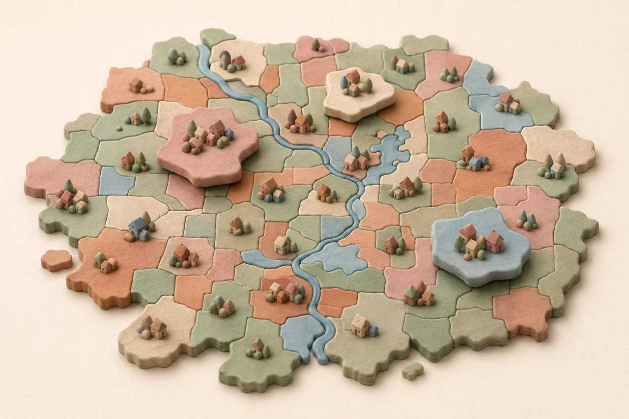
We built something we have wanted to exist for years: a live map of every existing-home sale in Dallas-Fort Worth, neighborhood by neighborhood, and we are giving it away.
The DFW Market Map covers 301,062 closed sales across 11 counties, from February 2022 through August 10, 2026. Type your address. It will tell you what share of sellers near you cut their price, how fast homes are going, what buyers are paying per square foot, how many are paying cash, and how all of it compares to a year ago. Every number is computed from the MLS feed brokers use, not scraped estimates.
No login, no email wall, no asterisk. We are a brokerage, so we will say the obvious part out loud: we would rather you know your market than take our word for it. The map is the argument.
Key Takeaways
- The DFW Market Map is free and live at homes.paragondfw.com/market-map: 301,062 resale closings across the 11-county DFW MSA, February 2022 through August 10, 2026, from the Paragon MLS warehouse (NTREIS), pulled 2026-08-11.
- The metro average describes almost no one. 47.1 percent of DFW sellers cut their asking price over the last 3 months, while Grapevine sits at about 25 percent with homes going in about a week and parts of the northern growth ring run above 65 percent.
- On value the spread is wider still. Metro-wide, buyers are paying about 3.5 percent less per square foot than at the 2024 peak, but the median sale in Dallas 75231 is up 46.6 percent in a year while 75243, five miles away, is down 22.1 percent.
- We count price cuts made by relisting, which most published statistics quietly drop. Counting them moves the metro 12-month price-cut rate from 44.6 percent to 52.8 percent, a difference of 8.2 points.
- Sold data only describes the sellers who succeeded. Over the trailing 12 months, 36.2 percent of resolved DFW listings ended without a sale at all.
- Seller credits are the second discount, invisible in every published price: $230,417,758 against $23,701,487,967 in 2026 sale volume, or 0.97 percent of every dollar transacted.
- Median-price moves measure what sold, not what your house is worth. Read the composition caveat before you celebrate or panic.
Why We Built It: One Average, Two Markets
The number you usually hear about "the DFW market" is an average across eleven counties, and it is nearly useless for your street.
Right now the metro says 47.1 percent of sellers cut their asking price over the last 3 months. But in Grapevine it is about 25 percent and homes go in about a week, while parts of the northern growth ring sit above 65 percent. Same metro, same week, opposite markets. The average hides both, and it hides them in the direction that costs money: the Grapevine seller reads a soft headline and prices defensively, and the growth-ring seller reads the same headline and prices like nothing changed.
There is a second reason a map like this did not already exist for you. Texas is a non-disclosure state. Sale prices are not public record here, so neighborhood-level sale numbers cannot be assembled from public records at all. Building them takes direct access to the MLS, where agents report closings.
We have the measured version. We are a brokerage with our own NTREIS feed and a warehouse of every existing-home closing back to February 2022, the same data we use to price listings. Publishing it costs us nothing except the argument that our numbers are proprietary. They are not.
Is Your Area Up or Down This Year? The Home Value Question
That is the question everyone actually has, and the metro average will not answer it.
Metro-wide, buyers are paying about 3.5 percent less per square foot than at the 2024 peak. The January through August window ran $201 per square foot in 2024 and $194 in 2026, a decline of about 3.5 percent. Current readings on the map sit at $195 over the last 3 months and $193 over the last 12.
That average hides wild swings. Here are one-year moves in the median sale price at the ZIP level, on trailing 3-month windows with at least 30 sales at both ends:
ZIP | Area | Median sale, a year ago | Median sale now | One-year change |
|---|---|---|---|---|
75231 | Northeast Dallas | $395,750 | $580,000 | up 46.6% |
75225 | Dallas | $1,545,000 | $2,211,000 | up 43.1% |
76234 | Decatur | $415,000 | $520,000 | up 25.3% |
75230 | Dallas | $979,000 | $790,000 | down 19.3% |
75243 | Northeast Dallas | $356,000 | $277,500 | down 22.1% |
*Paragon MLS warehouse (NTREIS), pulled 2026-08-11. University Park 75205 is up 33.8 percent, Fort Worth 76110 is down 19.3 percent, and Carrollton 75010 is down 19.2 percent over the same window.*
Look at the top and bottom rows. 75231 and 75243 sit roughly five miles apart in northeast Dallas, along the same freeways, and they are 68.7 points apart on the same measure, comparing the same trailing-3-month window one year apart. Neither shows up in a metro headline. Neither is described by "about 3 percent below peak."
Now the caveat that travels with every one of those numbers. A median-price move measures what sold, not what your house is worth. The median sale in 75231 is up 46.6 percent. That does not mean homes there gained 46.6 percent. It can mean bigger or renovated homes made up more of the sales mix this year, and in small samples it can mean some of that. The map carries this warning on its own rankings, and we repeat it because it is the most misused statistic in residential real estate.
What the number does tell you is still useful: the mix of homes selling in your area may have changed, and if you price straight off last year's comps, you may be pricing off a mix that no longer exists.
Tap your neighborhood on the map, switch to Median price or Price per sq ft, and read your own trend line back to 2023. The card tells you how your area compares to the metro, which direction it is moving, and when the sample is too small to trust. Thirty seconds, and you will know which side of the average you live on.
The Thirty Second Read: How to Get Your Own Numbers
The map is built for a phone. Here is the fastest path through it:
1. Search your address or ZIP. Tap your area for the full card: nine measures, how each one compares to the metro, and your own trend line back to 2023.
2. Pick the right area size. Part of town is a Paragon market area, ZIP is the unit you already think in, and Neighborhood drops to US Census tracts of a few thousand residents each. Smaller is more specific and noisier. The map softens areas under 15 sales and shows anything under 5 as a pale gray shape with no reading at all, so a pale shape is the map telling you not to trust it.
3. Set the time window deliberately. Last 3 months is the market as it is behaving now. Last 12 months is the number to quote to anyone. These are whole calendar months plus August 1 through August 10, not a trailing 90 days.
4. Use Compare. Open your area, tap Compare, then pick a second one on the map or in the search box. Two neighborhoods side by side answers most real questions in one screen.
5. Open Top 10, then flip it to Changing. Now shows where sellers are currently winning and losing. Changing shows which areas are heating up or cooling down over the past year, usually the more actionable of the two.
6. Copy Link captures your exact view, so you can send someone a specific claim instead of a screenshot.
One more feature worth knowing: the price range filter groups homes by first asking price. A $1.2 million house and a $280,000 house in the same ZIP are not in the same market, and blending them is how neighborhood statistics turn into noise.
The reporting rules, definitions, floors, and limitations are published on the page under About this data. We would rather you read the footnotes than trust us.
What This Map Publishes That Nobody Else Does
Two things in this map required us to be harder on the data than the industry usually is. Neither flatters our own industry, which is part of why you have not seen them.
The Chain First Rule
When a DFW seller cancels a listing and relists at a lower price, the MLS resets the "original" price. Most published statistics politely forget the first number, so the seller in our standing example who asks $525,000, goes quiet, relists at $475,000 and closes at $470,000 gets counted as a seller who never cut.
We do not. When a home was cancelled or expired and relisted within a year, the map measures against the FIRST asking price. About one in five sold homes had a hidden earlier listing at the same address, and counting them moves the metro price-cut rate from 44.6 percent to 52.8 percent over the last 12 months (a difference of 8.2 points). Over half of DFW sellers ended up asking less than their first price over that trailing-12-month window. (The table below uses the 2026 calendar year through August 10, a shorter window where the split sits at 50.2 to 49.8; the two windows are labeled so the numbers travel honestly.)
Running the same chain-first rule across 2026 closings through August 10 splits the market almost exactly in half, and the halves do not look like the same year:
2026 closings (n = 42,185) | Held the first asking price | Cut, counting relists |
|---|---|---|
Share of closings | 50.2% | 49.8% |
Closed at, as a share of first ask | 100.0% | 91.3% |
Days to contract (continuous) | 11 | 77 |
Dollars below first ask | $0 | $37,500 |
All-in giveback | 1.8% ($7,000) | 9.8% ($42,000) |
*Paragon MLS warehouse (NTREIS), pulled 2026-08-11. All-in giveback is the distance between the first asking price and what the seller kept after credits, expressed as a share of the first ask. Medians throughout.*
The two columns are 66 days apart (77 minus 11) and about $35,000 apart on the all-in number ($42,000 minus $7,000), which is 8.0 points of giveback. The half that held the first number closed at 100.0 percent of it in under two weeks. Read that as correlation, not proof.
The Survivor Problem
Sold data only tells you about the sellers who succeeded. Every median price, every days-on-market figure, and every "homes are still selling fast" headline is computed on the survivors.
Over the last 12 months, 36.2 percent of DFW listings that reached a resolution ended without a sale at all. Out of 108,138 resolved listings, 39,095 listings were cancelled, expired, or withdrawn (39,095 divided by 108,138 is 36.2 percent). The map says so right on the page, under What counts as a sale, because a market where one in three listings fails is a different market than the one the sold headlines describe.
This should change how you read every other number on the map. A neighborhood card describes the homes that made it. The ones that did not are not in the median, not in the days-to-sell figure and not in your comparative market analysis.
The Second Discount: Seller Credits Are Invisible in Every Published Price
There is a discount in DFW that never appears in a price at all.
A seller contribution is a credit the seller pays at closing. The recorded sale price is gross. It does not subtract the credit. So the price that lands in the comps, in the appraisal, in tax protest evidence, and in the online estimates is a number some of the money never actually cleared.
In 2026 closings where the field is reported, 57.2 percent of DFW sellers paid one (25,779 of 45,104). The median contribution among sellers who paid was $7,697, or 2.0 percent of the close price. Across the 45,196 closings where the contribution field is reported, including the ones with no credit at all:
Measure | Value |
|---|---|
Total seller contributions | $230,417,758 |
Total sale volume | $23,701,487,967 |
Contributions as a share of all dollars transacted | 0.97% |
Median contribution as a share of close price | 0.47% |
Share of closings with a credit worth 1% or more of price | 43.2% |
Share with a credit worth 2% or more | 29.6% |
Share with a credit worth 3% or more | 15.5% |
Share with a credit worth 5% or more | 3.5% |
*Paragon MLS warehouse (NTREIS), pulled 2026-08-11.*
Be precise here, because the sloppy version of this claim is everywhere. It is not true that every DFW price is overstated by 2 percent. The 2.0 percent figure is the median among sellers who actually paid a credit. Market-wide it is 0.97 percent of every dollar ($230,417,758 divided by $23,701,487,967), and the median closing carries 0.47 percent. What is true is that nearly a third of DFW sales carried a credit worth 2 percent or more of the price, and none of it is visible in the number anyone quotes back to you.
It is also not a loss. Sellers did not lose $230 million; they paid it to close deals, and many recovered it in the headline price. The point is that it is invisible, and invisible money distorts comps, appraisals, online estimates, tax protests and equity math for every homeowner here, not just the ones selling.
The map surfaces this as Seller credits, one of the nine measures. Where credits are common, the published prices describe a slightly softer market than they appear to.
The Honest Counterargument: What a Map Cannot Tell You
We built it and we still want you to hold it at arm's length. Four limits, plainly.
Correlation is not causation. The sellers who held their first price and closed at 100.0 percent of it were not rewarded for stubbornness. Many were simply priced right, or sat in a hot submarket, or owned a better house. A price cut is usually the symptom of an initial overprice, not the cause of the loss. What the data supports is that the first price is the decision that matters most, and by the time you are cutting, most of the damage is already priced in. It does not support "cutting costs you money."
Composition beats appreciation in small samples. Once more: the median sale is up, not your house. A ZIP where a handful of large homes traded will post a rise no individual homeowner experienced. The map enforces a 30-sale minimum at both ends before showing a year-over-year change, and it still cannot see the mix.
It is resale only. New construction and builder sales are excluded, which matters enormously in the growth ring, where the builder down the road is your real competition and is not on this map.
A map is not a valuation. Nine medians for your area are context, not a price for your specific house with its specific roof, floor plan and backyard. Anybody who tells you a neighborhood statistic is a home value is selling something.
This movie has played before. In 2008 the whole country read one national housing story, and that story described almost nobody's street. Neighborhoods a few miles apart had completely different decades. The lesson was not that the data was wrong. It was that the unit of analysis was too big to be useful, and the people who did fine knew their own block. That is the entire thesis of this map.
The Paragon Angle
Here is the part that is opinion, clearly labeled.
Most real estate marketing is built on information asymmetry. The agent has the MLS, you have a portal estimate, and the gap is where a lot of commissions get justified. That model is dying and deserves to. The value we add is not knowing the price-cut rate in your ZIP code. It is knowing what to do about it.
So we would rather hand you the numbers and compete on judgment. If the map shows your neighborhood with the median sale down and cut rates climbing, that is not a reason to call a broker who will tell you the market is fine. It is a reason to talk about pricing, timing and presentation before you list, because the data above says the first asking price carries most of the outcome.
Three things we believe the map makes obvious that the industry generally does not say:
- Days on market is a price signal, not a marketing signal. When a home sits past the local median, the market has already answered the question. Cutting later confirms it rather than fixing it.
- The failure rate is the real market. 36.2 percent of resolved listings ending unsold is the most honest single statistic in DFW right now, and no sold report will ever show it to you.
- Your area's number is the one that matters. A broker quoting you a metro average for your specific house is using an eleven-county tool for a one-street question.
We publish this because a client who understands their own market is a better client. That is the entire commercial logic.
Frequently Asked Questions
Is my DFW neighborhood's home value going up or down in 2026?
It depends entirely on where you are, and the metro number will mislead you. Metro-wide, buyers are paying about 3.5 percent less per square foot than at the 2024 peak. But over the last year the median sale is up 46.6 percent in Dallas 75231 and down 22.1 percent in 75243, roughly five miles away. Open the DFW Market Map at homes.paragondfw.com/market-map, search your address, and switch the measure to Median price or Price per sq ft. Remember that a median-price move describes what sold in your area, not what your individual home is worth.
How do I find out what homes are actually selling for near me in Texas?
Texas is a non-disclosure state, so sale prices are not public record and portal estimates are models rather than measurements. The DFW Market Map is computed directly from the NTREIS MLS feed brokers use, covering 301,062 resale closings across 11 counties from February 2022 through August 10, 2026. It reports medians by area rather than individual sale prices, which is the level the reporting rules allow us to publish.
What percentage of DFW sellers are cutting their price right now?
47.1 percent over the last 3 months, metro-wide. Over the last 12 months it is 52.8 percent, counting cuts made by relisting, which most published statistics drop. Without relists the same 12-month figure reads 44.6 percent. The range is enormous: about 25 percent in Grapevine, above 65 percent in parts of the northern growth ring.
How many DFW homes do not sell at all?
Over the trailing 12 months, 36.2 percent of resolved DFW listings ended without a sale, out of 108,138 resolved. Roughly one in three. Those sellers cancelled, expired, or withdrew, and they appear in no sold statistic anywhere, which is why sold-only reporting makes this market look easier than it is.
Does the DFW Market Map include new construction?
No. Existing homes only. Builder sales are excluded, which is worth remembering in the fast-growing northern and eastern suburbs, where a resale seller can find themselves competing with new construction nearby.
Is the map free, and do I have to give you my email?
It is free, and no. No login, no email wall. It works best on a phone, and the methodology, floors, definitions and limitations are published under About this data.
Conclusion
The honest summary of DFW in August 2026 is that there is no such thing as the DFW market. There is a metro that cut prices on 47.1 percent of sales over the last 3 months and failed to sell 36.2 percent of its resolved listings over the last year, and inside it there are neighborhoods a few miles apart running in opposite directions at the same moment. That is not a problem you solve with a better headline. It is one you solve with a smaller unit of measurement.
So go get yours. The DFW Market Map is live, it is free, and it will take about thirty seconds to find out which side of the average you live on. It is rebuilt with each newsletter issue, so the numbers move as the market does.
If it tells you something about your neighborhood you were not expecting, that is usually worth a conversation. We built the map because we would rather show you the market than adjective it at you.
Ready to price a home, buy one, or just get a straight read on your neighborhood? Let's connect and discuss your goals.
Email: [email protected]
Phone: (469) 290-7593
Online: paragondfw.com/contact
Sources
- DFW Market Map, About this data: homes.paragondfw.com/market-map. Scope, reporting floors, chain-first cut definition, time windows, data dates.
- Paragon MLS warehouse (NTREIS), pulled 2026-08-11: 301,062 resale closings, 11-county DFW MSA, February 2022 through August 10, 2026. New construction and builder sales excluded.
- Paragon MLS warehouse (NTREIS), pulled 2026-08-11: metro price-cut share, 47.1 percent trailing 3 months, 52.8 percent trailing 12 months chain-first (44.6 percent per-listing).
- Paragon MLS warehouse (NTREIS): chain-first analysis of 2026 closings through August 10 (n = 42,185). Held versus cut split, close-to-first-ask ratios, continuous days to contract, all-in giveback.
- Paragon MLS warehouse (NTREIS): resolved-listing outcomes, trailing 12 months, n = 108,138 resolved, 36.2 percent unsold.
- Paragon MLS warehouse (NTREIS): seller contributions, 2026 closings where the field is reported: 57.2 percent paid (25,779 of 45,104); totals $230,417,758 against $23,701,487,967 across 45,196 reported closings.
- Paragon MLS warehouse (NTREIS), pulled 2026-08-11: one-year median-sale movers by ZIP, trailing 3-month windows, 30-sale minimum at both endpoints.
- Paragon MLS warehouse (NTREIS), pulled 2026-08-11: metro price per square foot, January through August windows, $201 in 2024 and $194 in 2026; current $195 over 3 months, $193 over 12.
- Paragon Realty Advisors, "America's Fastest-Growing City Is Getting Cheaper," 2026-07-19: https://paragondfw.com/blog/americas-fastest-growing-city-is-getting-cheaper